ACOMB ACRES
Brand Identity | Agriculture, Western NY
Acomb Acres is a farm near my hometown in Upstate New York. It's a 3rd generation farm, established in 1954. They raise livestock ranging from pigs and bovine, and grow cash crops like corn, beans and hay. I've known the Acomb family since I can remember and went to school with one of them, Pat. So when his brother Bryan reached out for branding needs it was an obvious yes.
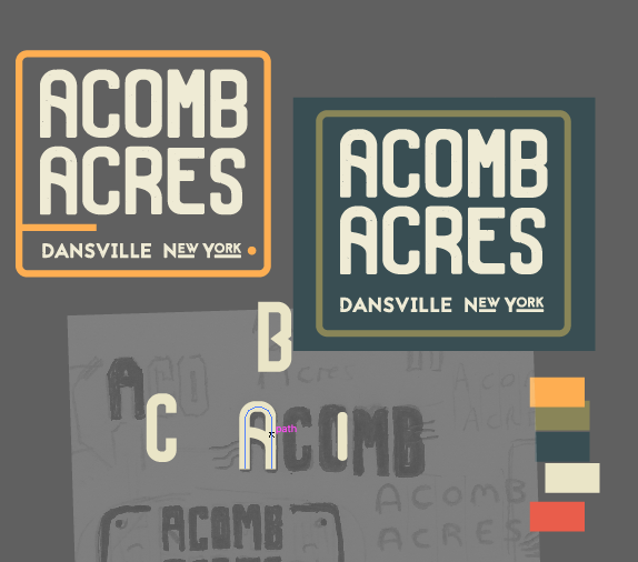
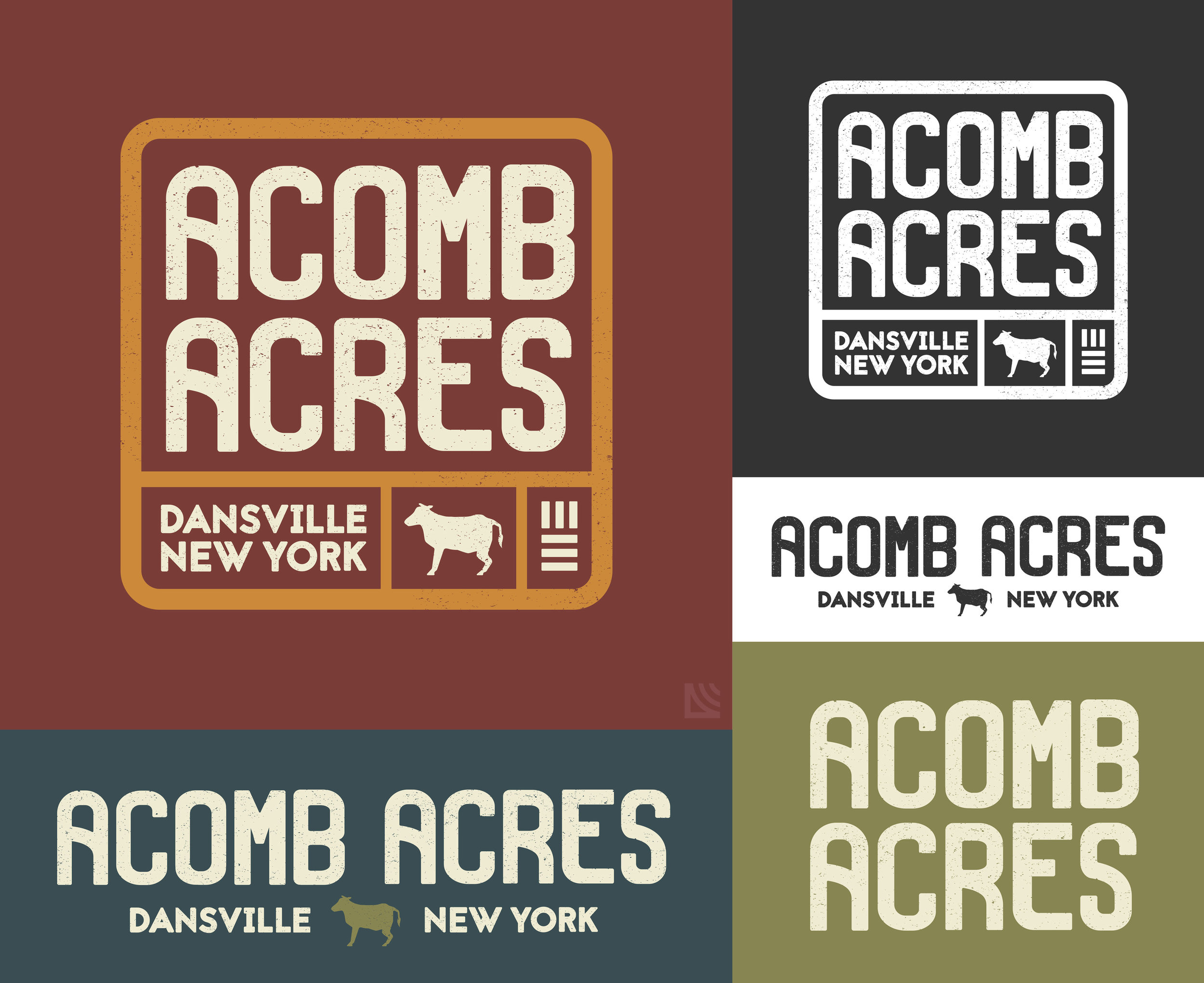
I've found I really enjoy designing for farms. I recently did branding for Maytop Farms, another local farm in the area. Both Maytop Farms and this one I approached with a logotype. I find custom type is fitting for a hands-on industry such as farming. Every farm is different and their logos should showcase this. I took a lot of inspiration from farm signs I'd see around growing up and rustic, bold type. The gridded look is industrial and takes cues from produce packaging. The symbol in the corner right represents crop rows.


