BRAND IDENTITY PROCESS: PATHFINDER MOTO TOURS
I designed a logo for the motorcycle tour service, Pathfinder Moto Tours. Here's my process for creating a logo.
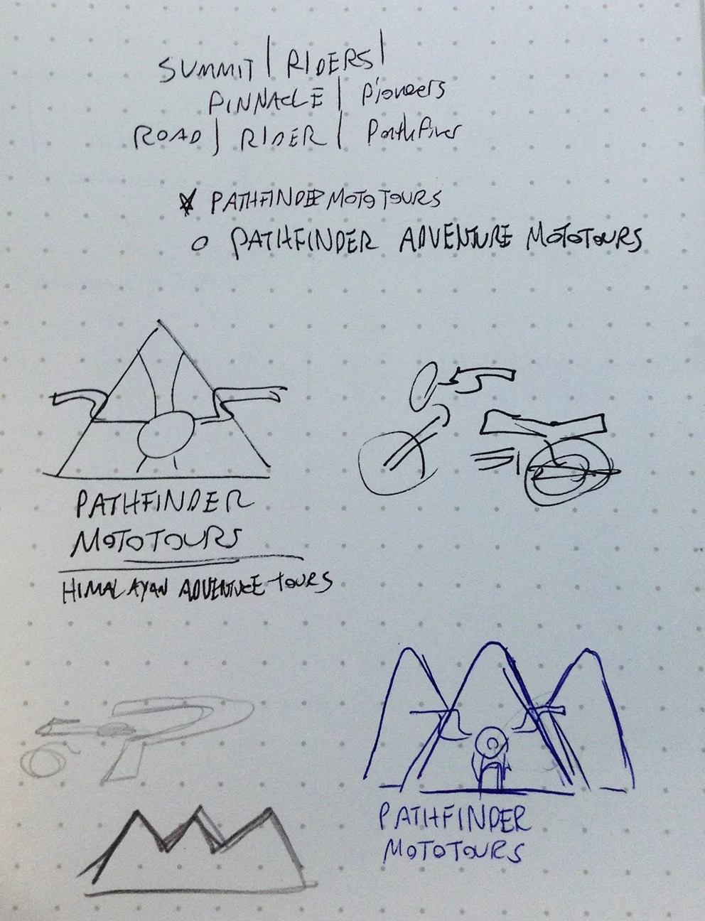
BRAINSTORMING: it's important to get to know who you're designing for. Pathfinders is a adventure agency in India, so there was more than enough to work with. Motorcycles was obviously a focus, so I wanted to include a simplified version of one, and not a clip-art looking image like a lot of the other tour agency logos in the area.
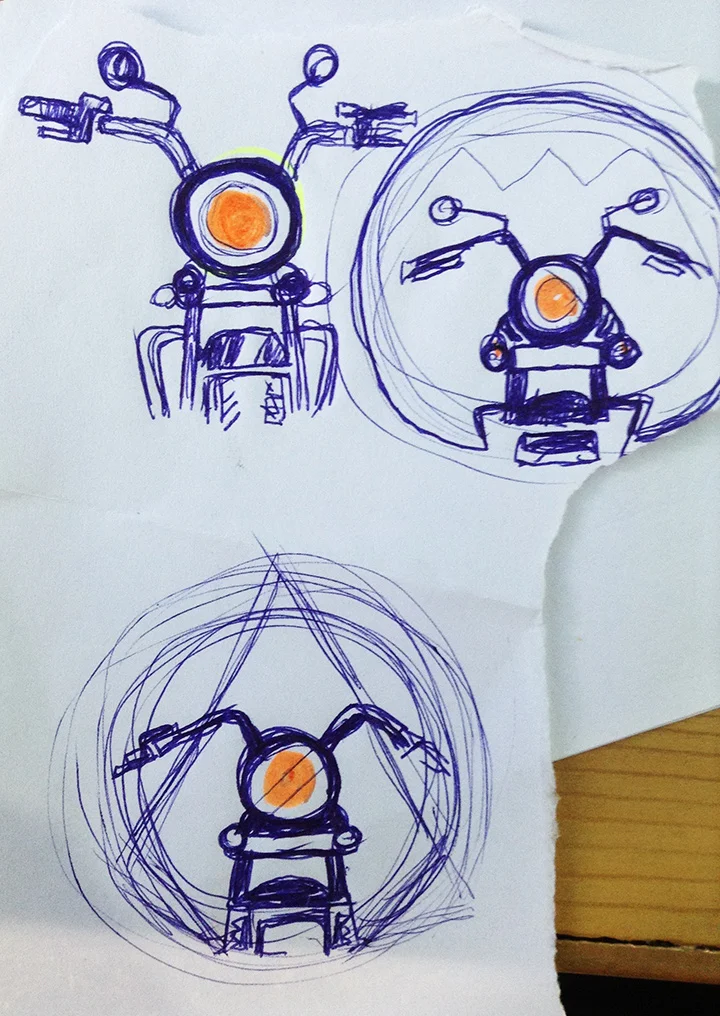
SKETCH REFINEMENT: After spitting out some bad ideas, I move on to narrow down options. I talked to Vivek and Ganesh, the proprietors of the business, to extract opinions and ideas. Sometimes this can be like pulling teeth but they seemed to know what they wanted. After going back with colors and the shape we collectively agreed a circle with a bike inside it would work well. So i took a crappy pen and drafted some options and went from there.
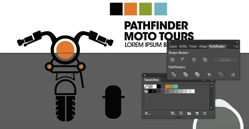
VECTOR: Now I take the sketch and drop it into illustrator to mess with the shape and feel of the design. I had some problems to solve with negative space and line weight and proportions to make it not look like a crotch-rocket.
BRANDING: One of the final steps was to create a cohesive brand with the finished vector work. Finding type, secondary optional colors if needed, and different layouts of the logo. It's all about versatilely: does the logo work vertically? Can it be black and white? Can it be shrunk or enlarged? I made sure to check these boxes.
SPREAD IT LIKE THE PLAUGE: That means putting it on stickers, social media, banners, photos, whatever it takes to market the logo and make it distinguishable. Which, of course takes time.


